Fundamentals of Colour Workshop
2nd edition
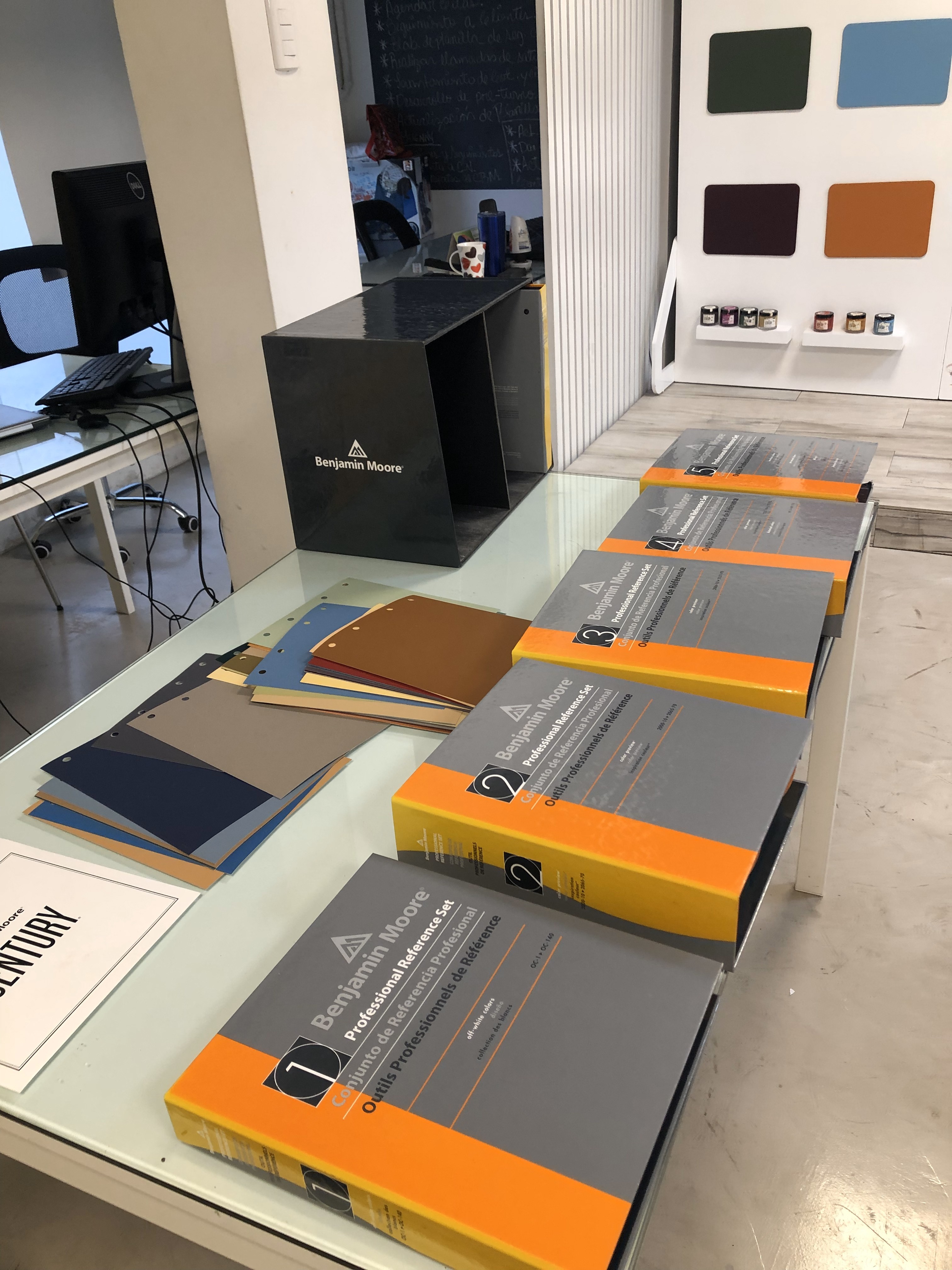
Benjamin Moore Dominican Republic
Santo Domingo 2021

How do you translate someone’s personality into colour, material and atmosphere?
Following the first edition of Fundamentals of Colour, the workshop returned with a new audience and a different challenge.
While the first edition introduced colour as a design tool to professionals from multiple creative disciplines, this second edition was developed specifically for Interior Design students, shifting the focus from understanding colour to actively using it as part of the design process.
The workshop explored four fundamental areas:
Colour Theory · Colour of the Year · Colour Harmonies · Moodboard Creation
But the final objective was not simply to create a palette that looked good.
Students were challenged to understand how colour combinations can communicate personality, emotion and intention — and how those abstract qualities can eventually become tangible design decisions.
From Colour to Personality
Colour is often one of the first elements used to communicate the character of an interior.
But choosing a palette based exclusively on personal preference can quickly become arbitrary.
The workshop therefore encouraged students to describe colour through adjectives and qualities.
Is a palette energetic or restrained?
Sophisticated or playful?
Warm or distant?
Soft or dramatic?
Once colour begins to communicate an intention, the palette becomes part of a concept rather than simply a collection of attractive shades.
A Fictional Client
For the final exercise, each student received a randomly assigned client.
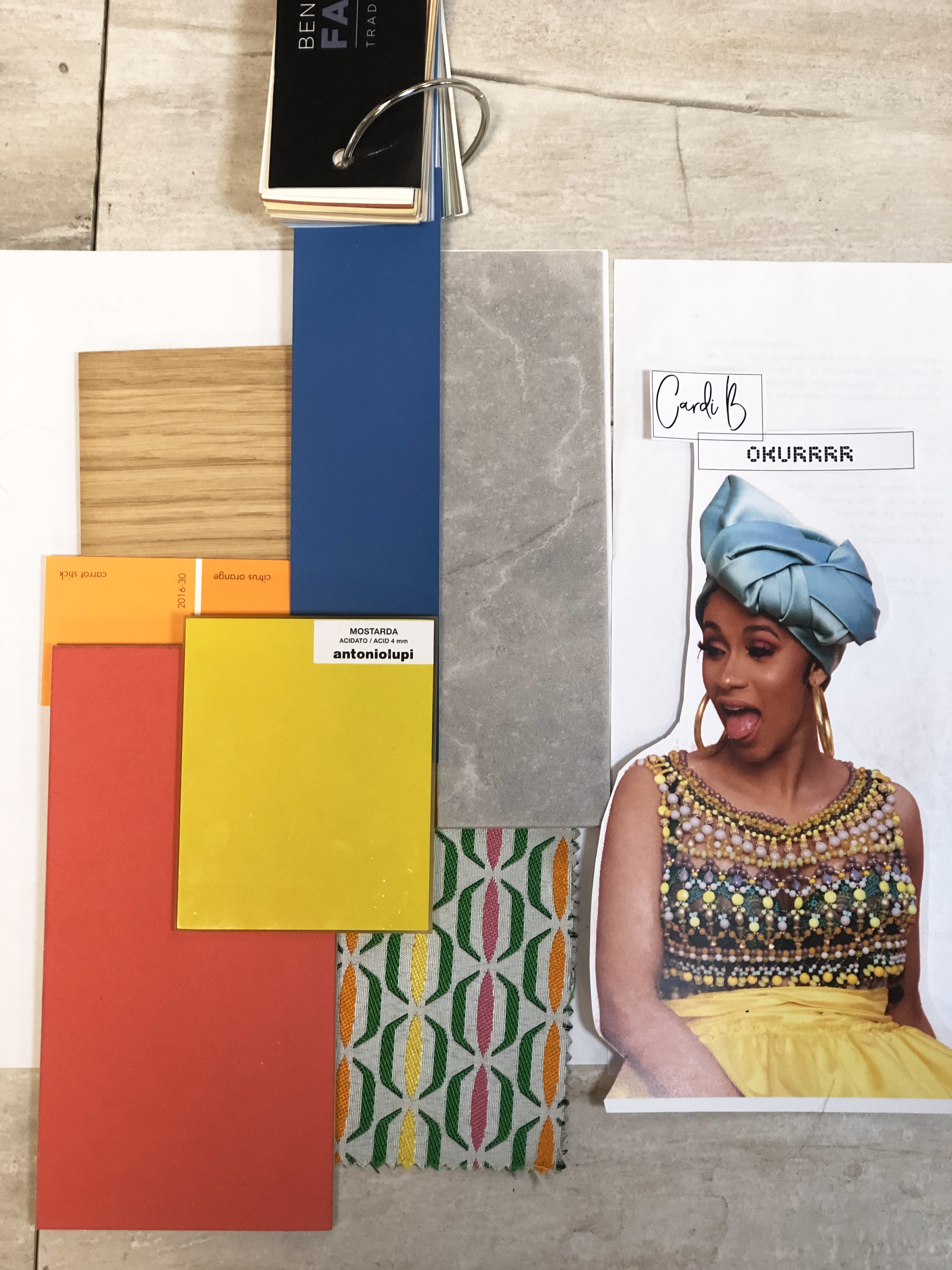
Rather than conventional client profiles, the exercise used recognisable public figures whose personalities, aesthetics and public identities provided enough information to construct an initial interpretation.
Students first analysed what they already associated with their assigned character.
What words describe this person?
What atmosphere might represent them?
Which colours communicate those qualities?
The objective was not to reproduce the person’s existing style literally, but to learn how to extract characteristics and translate them into a design language.
Building a Colour Strategy
With a conceptual direction established, students applied the principles explored throughout the workshop to develop their own colour combinations.
Colour harmonies provided a starting framework, but students were encouraged to move beyond formulas and make decisions according to the personality they wanted the space to communicate.
The palette therefore became a strategy.
Each colour needed a reason to exist within the composition.
From Palette to Material
The final stage transformed the colour concept into a physical material moodboard for a specific interior space.
Paint was no longer the only expression of colour.
Students considered how the palette could emerge through timber, stone, textiles, metals, finishes and other tactile surfaces.
This transition was essential.
In an interior, we rarely experience colour independently. We experience it through material, texture, light and scale.
The exercise therefore connected an abstract concept — personality — with a tangible design proposition.
Personality → Adjectives → Colour → Material → Space
Designing With Intention
The final outcome was not simply a collection of moodboards.
The exercise introduced students to a process they would repeatedly encounter in professional interior design: understanding a client, interpreting intangible characteristics and translating them into a coherent spatial language.
Colour became the bridge between concept and materiality.
And the question shifted from:
Which colours do I like?
to:
Which colours communicate the story I am trying to tell?
Workshop
Fundamentals of Colour · Second Edition
Audience
Interior Design Students
Topics
Colour Theory · Colour Harmonies · Client Profiling · Materiality · Moodboards · Concept Development
Role
Workshop Creator · Lecturer · Facilitator





I’m always open to new projects, meaningful, collaborations or a good conversation.
Let’s connect.