Fundamentals of Colour Workshop
1st edition
Benjamin Moore Dominican Republic
Santo Domingo 2021

Colour is not simply something we apply to a surface.
It can define atmosphere, influence perception and become the starting point for an entire material language.
Fundamentals of Colour was conceived and led by Sarah Tió as a workshop exploring colour beyond its conventional association with paint.
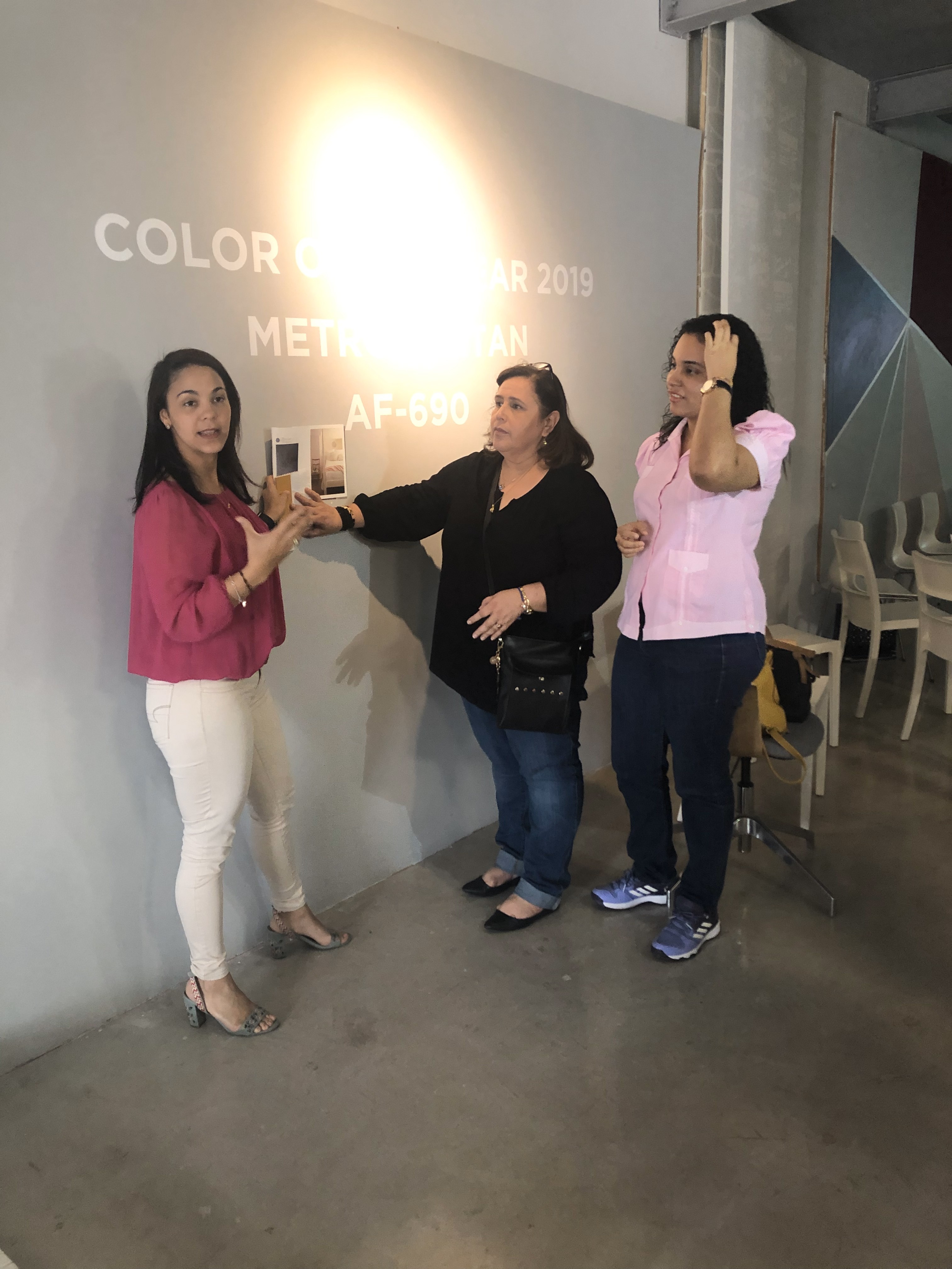
Using Benjamin Moore’s Colour of the Year and its related colour palette as a starting point, the session invited participants to understand how colour works — where it comes from, how it interacts with other colours and how it can ultimately inform decisions about materials, textures and spatial atmosphere.
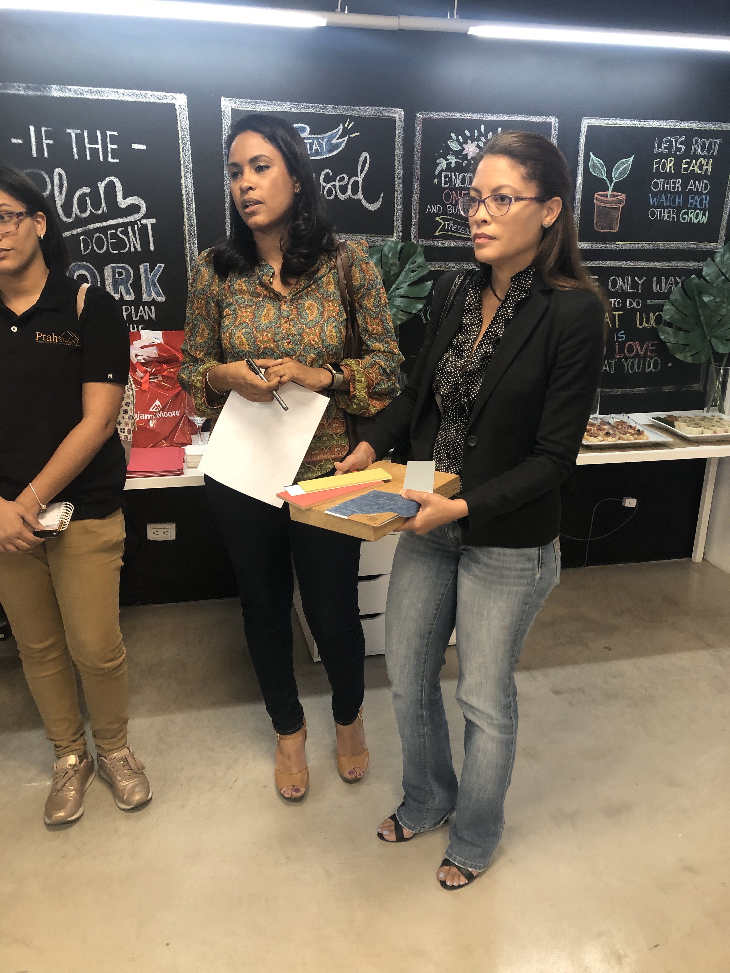
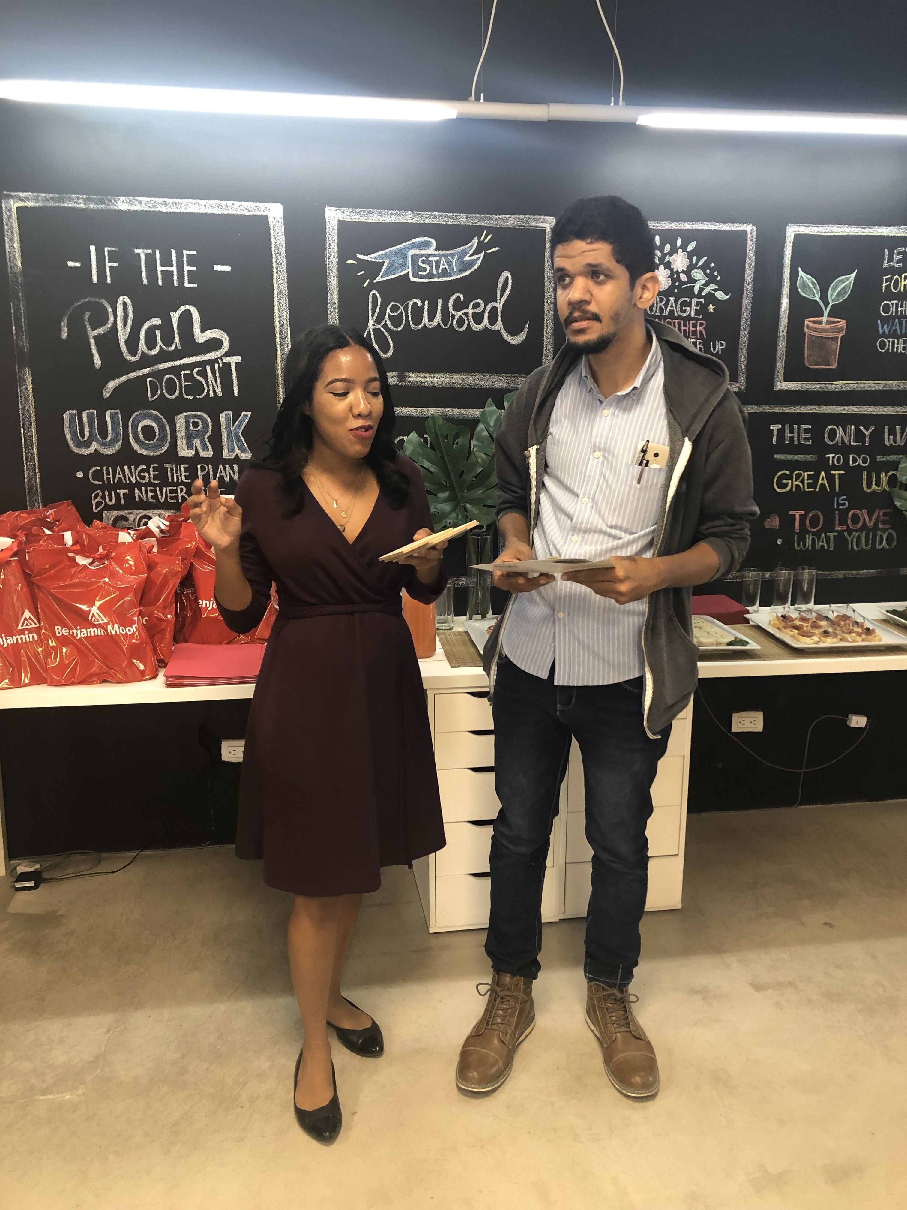
The first edition brought together professionals from different creative disciplines, including architects, interior designers, graphic designers, advertising professionals and marketers.
This multidisciplinary environment became an important part of the exercise: although each profession approaches colour differently, the principles behind how we perceive, combine and communicate it remain interconnected.
01 — Understanding Colour
The workshop began with the fundamentals.
Through an interactive presentation and visual examples, participants explored the principles of colour theory and the characteristics that allow us to describe and differentiate one colour from another.
Rather than memorising terminology in isolation, the objective was to connect theory with familiar visual references and understand how those principles influence everyday design decisions.
02 — Reading the Colour of the Year
The Benjamin Moore Colour of the Year became a case study for analysing colour beyond its name or visual appearance.
What does it mean when a colour is described as calm, sophisticated, energetic or warm?
By looking at colour through both technical characteristics and descriptive language, participants explored how a single hue can communicate different moods and associations.
Colour became not only something to see, but something to interpret.
03 — Building Colour Harmonies
Once the fundamentals had been established, the workshop moved into relationships between colours.
Participants explored different colour harmonies and palette compositions, identifying combinations connected through shared or complementary characteristics.
But these principles were presented as tools rather than rigid formulas.
Understanding the rules makes it possible to use them intentionally — and, when the concept requires it, to break them.
04 — From Colour to Moodboard
The final exercise transformed theory into a design proposition.
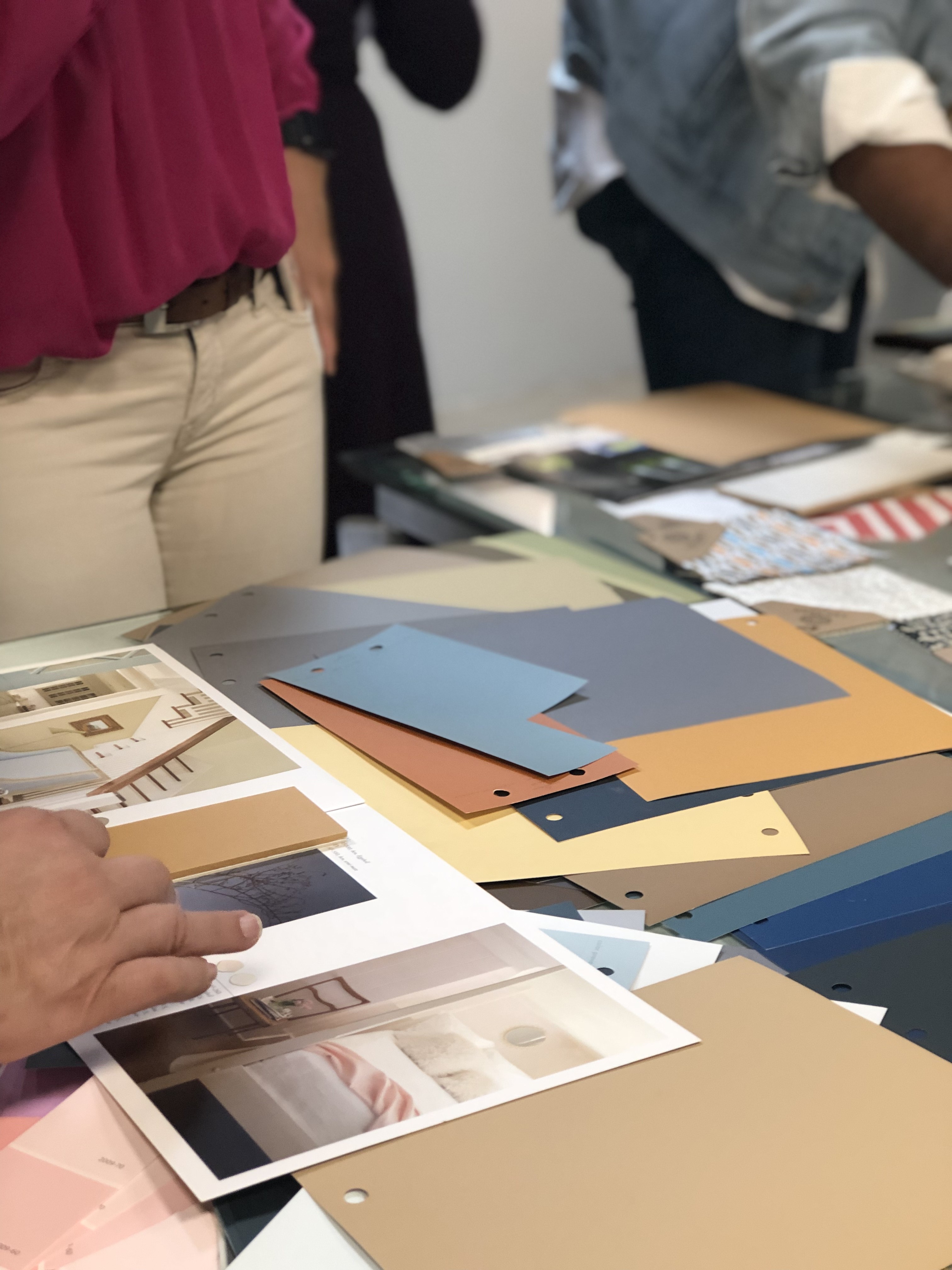
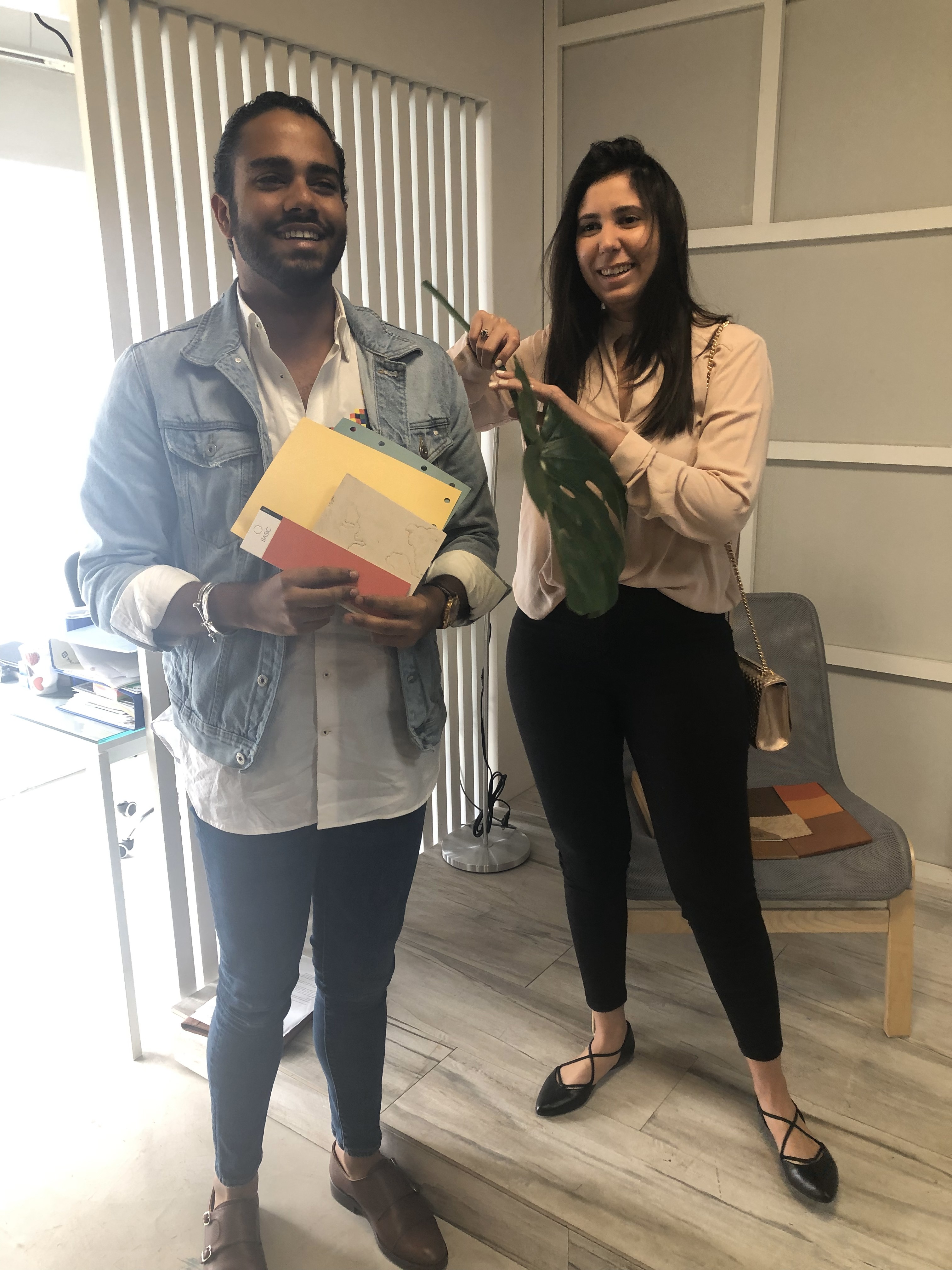
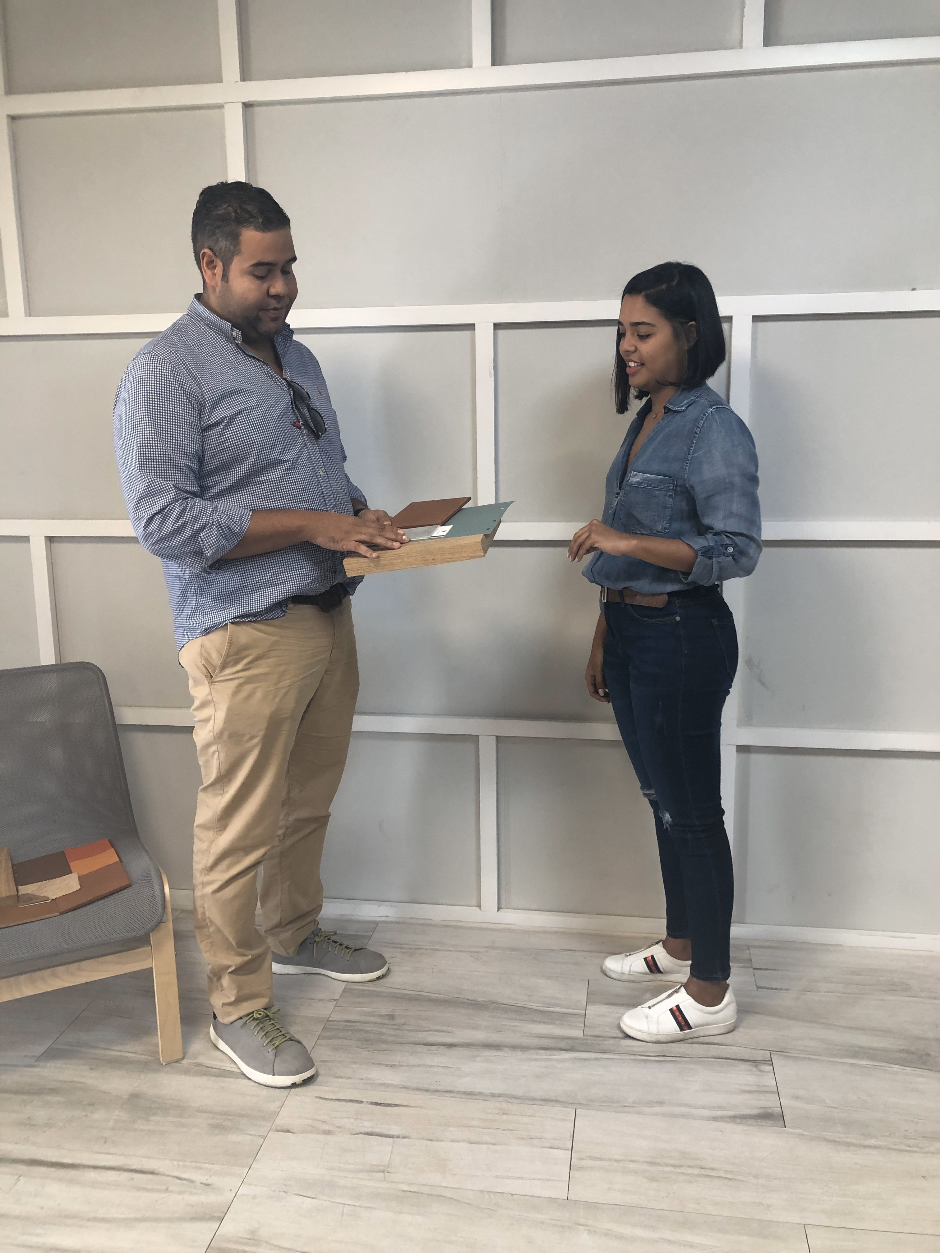
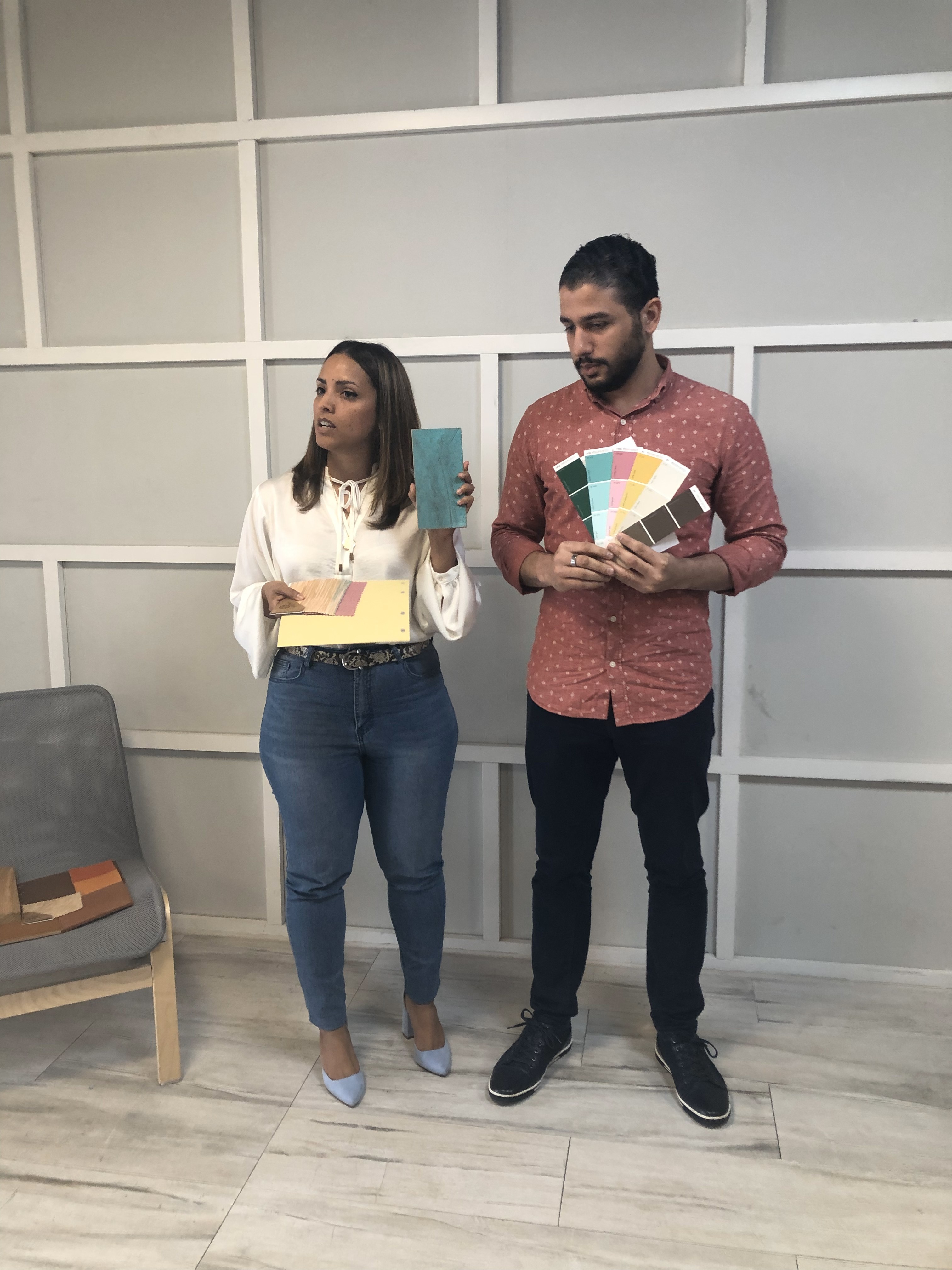
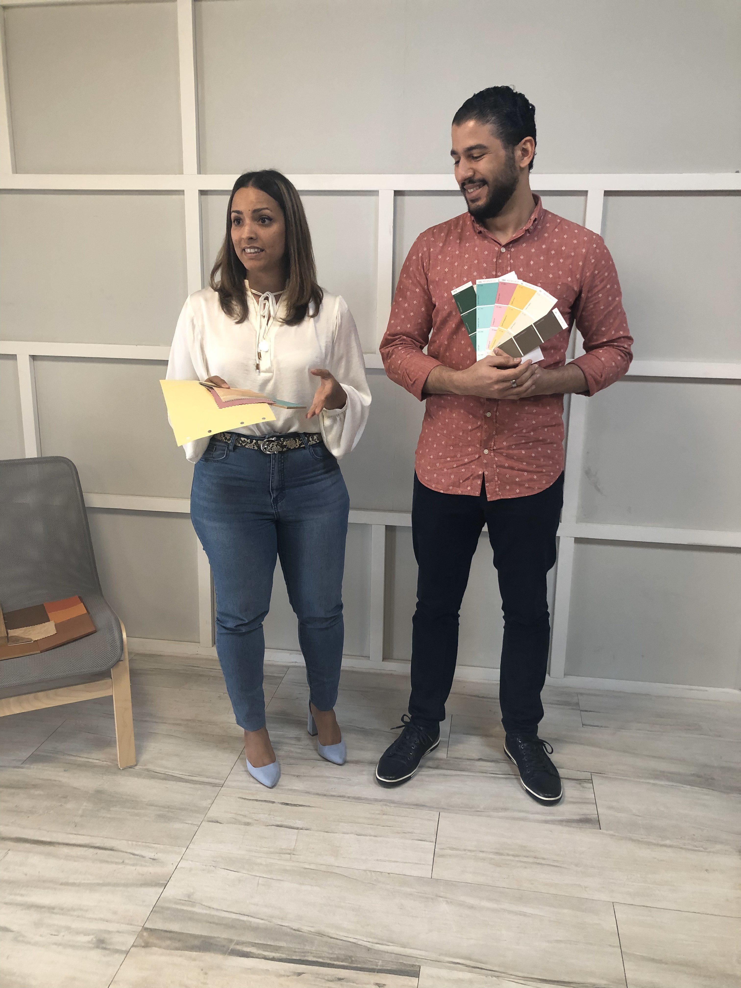
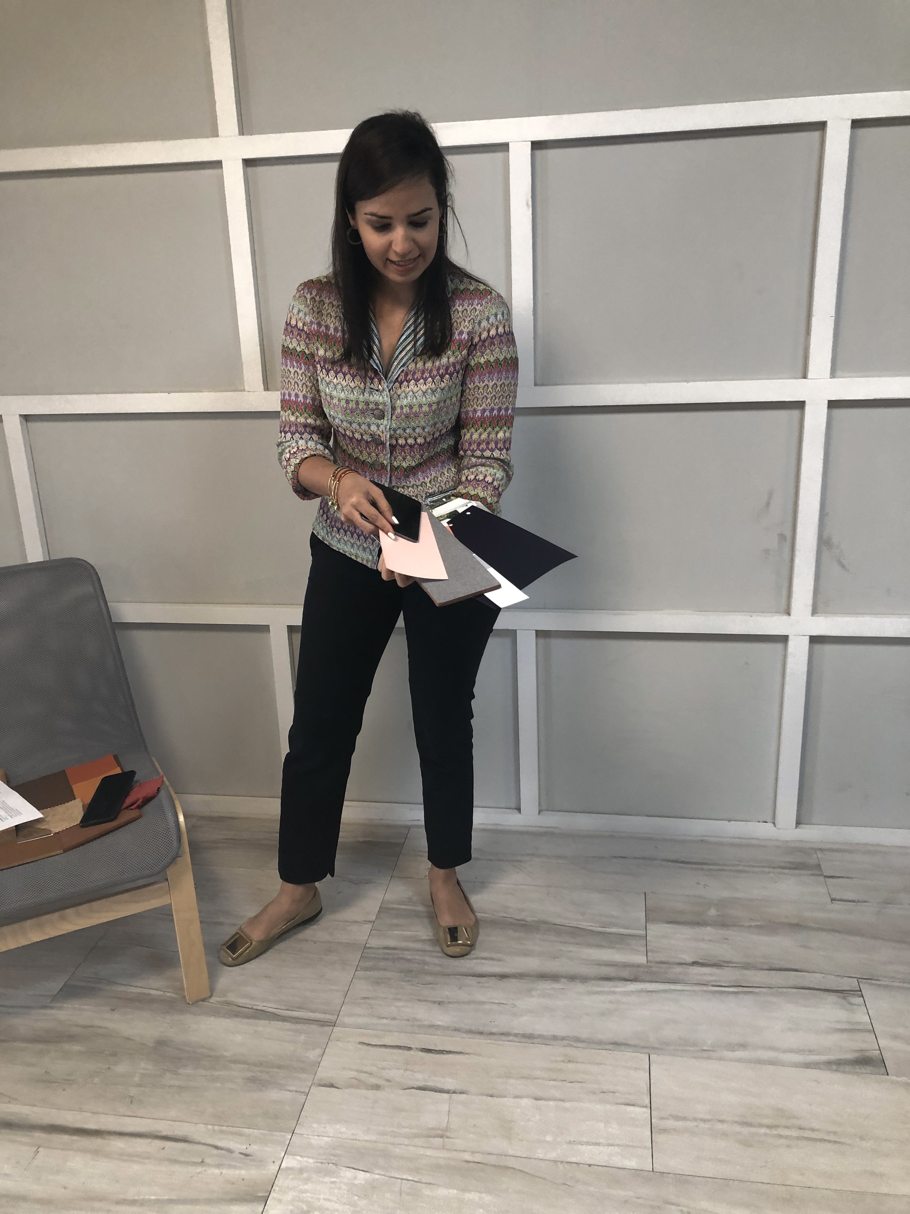
Working in teams, participants created moodboards in which colour became the starting point for a broader visual and material narrative.
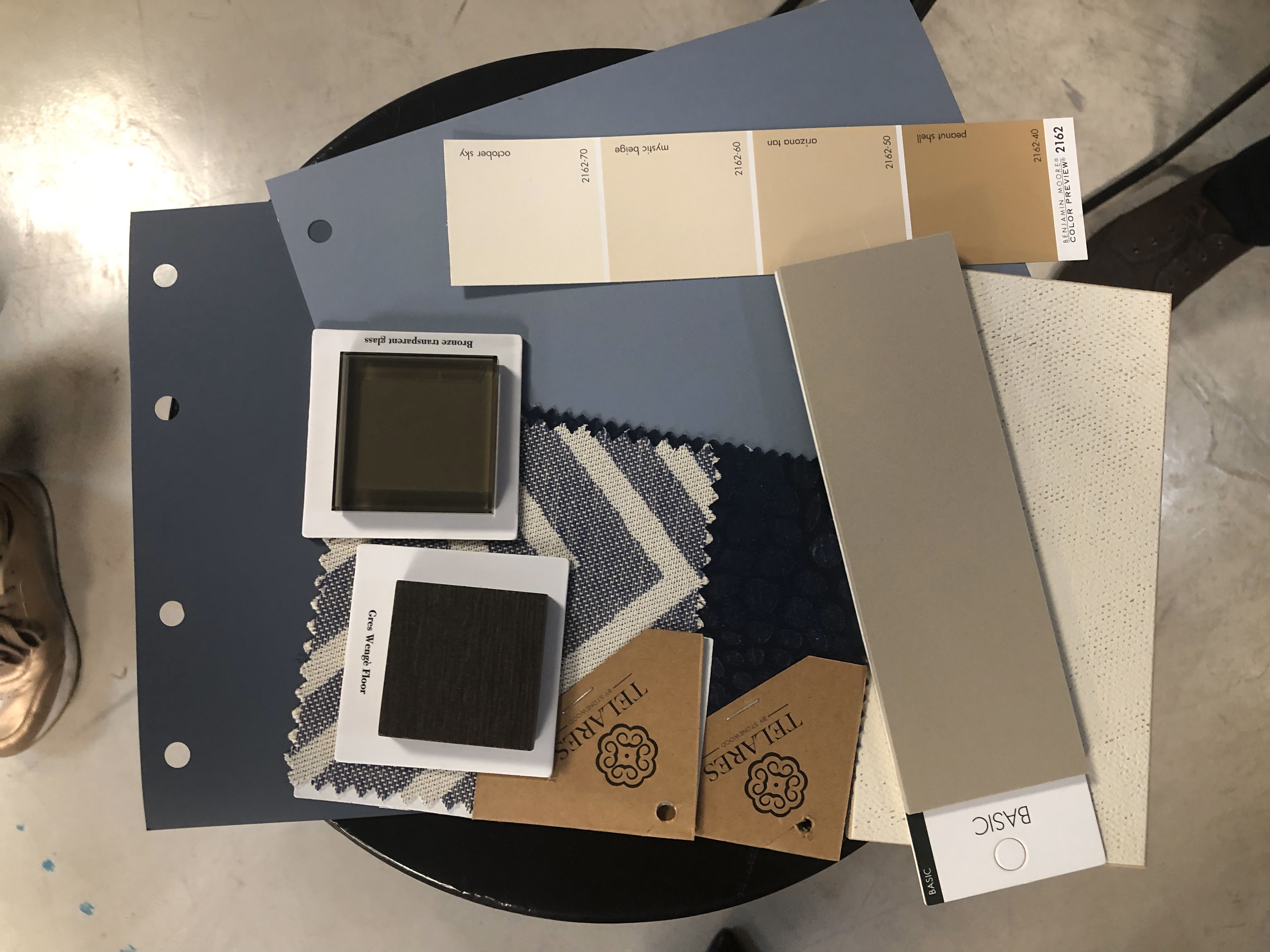
The palettes expanded into materials, textures, finishes, qualities and descriptive concepts, demonstrating how a colour strategy can influence much more than the selection of paint.
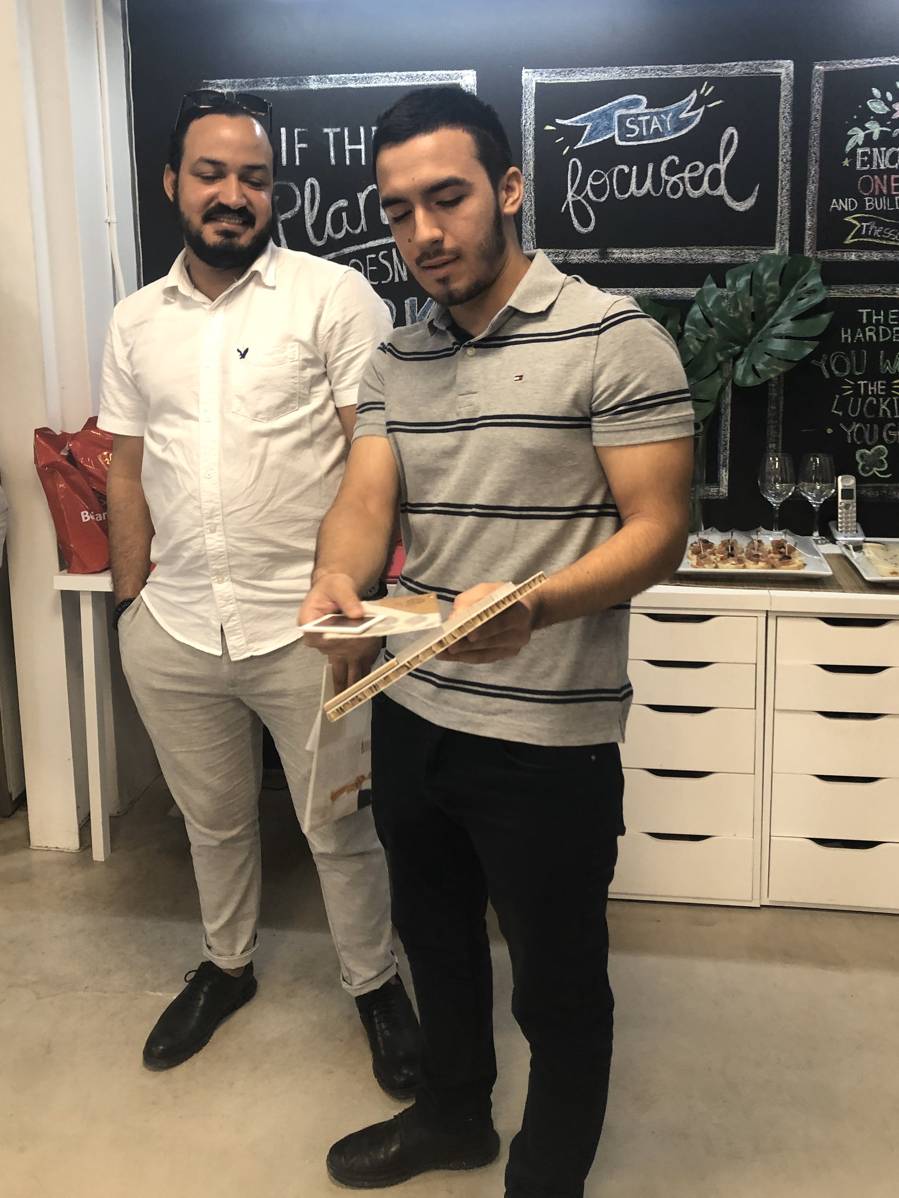
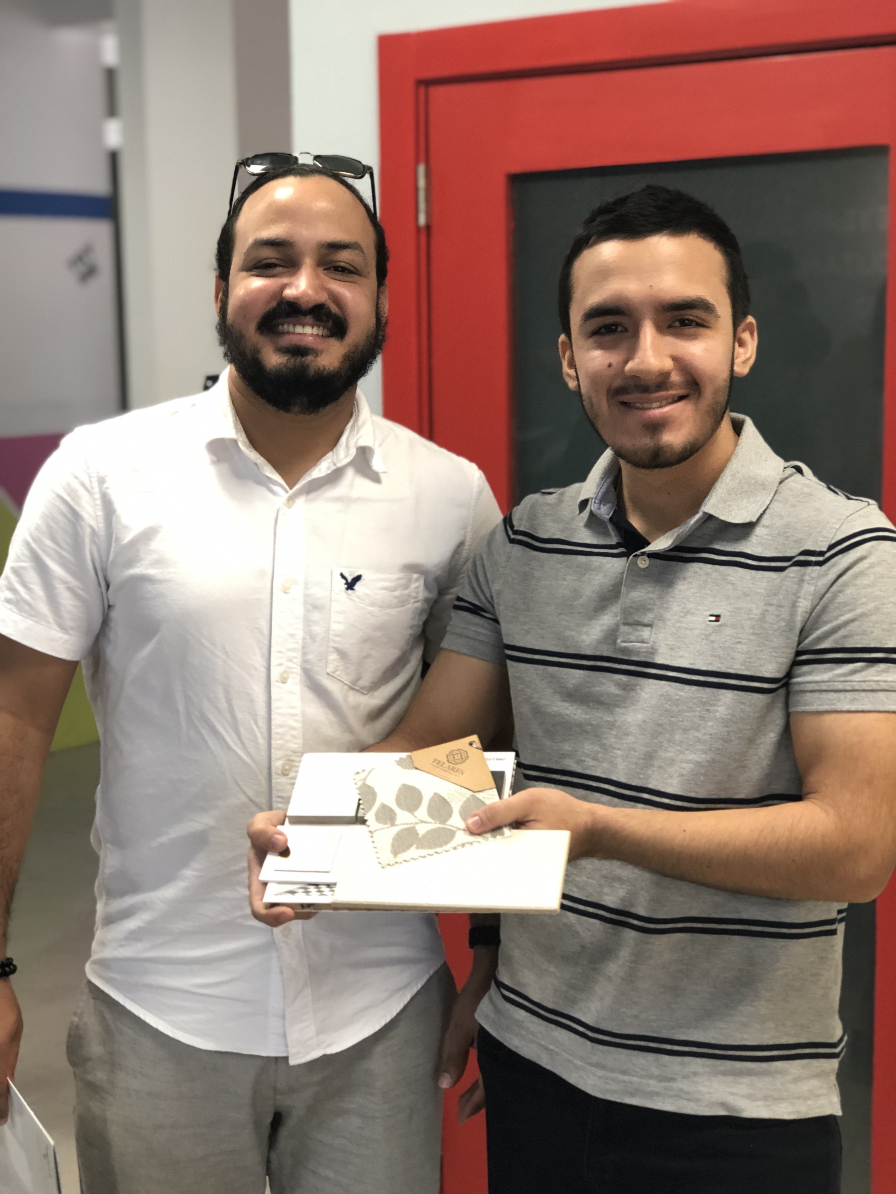
Each group then presented its proposed combination and described the type of space in which it could be applied.
The exercise shifted the conversation from:
Which colours work together?
to:
What kind of experience can these colours create?
Colour as Material Language
The objective of the workshop was ultimately to understand colour as part of a larger design system.
A colour rarely exists independently within an interior. It interacts with light, texture, material, scale and surrounding surfaces.
The same colour can feel completely different when expressed through painted plaster, natural stone, timber, textile or a reflective finish.
Learning how to construct a palette therefore means learning how to establish relationships between all of these elements.
Colour is not the final layer of a design. It can be one of the ideas from which the design begins.
Workshop
Fundamentals of Colour
Format
Interactive Workshop · First Edition
Topics
Colour Theory · Colour Harmonies · Materiality · Moodboards · Interior Design · Visual Perception
Audience
Architects · Interior Designers · Graphic Designers · Advertising & Marketing Professionals
Role
Workshop Creator · Speaker · Facilitator







I’m always open to new projects, meaningful, collaborations or a good conversation.
Conectemos.